Color Psychology in Christmas Fashion Marketing
Written by Galilea Matus
Holiday fashion always looks the same. But why do we love it anyway? The answer lies in something called color psychology. Color psychology is the study of how colors influence human behaviors and emotions, affecting everything from mood and perception to the choices we make as consumers. This can be observed during any season, but Christmas is the period where it happens the most. Christmas is a holiday known for tugging at people's emotions, and that goes much deeper than one would think. Those feelings don’t just show up when we see our grandma on Christmas or watch our little nieces and nephews happily opening gifts—they also happen when we’re shopping.
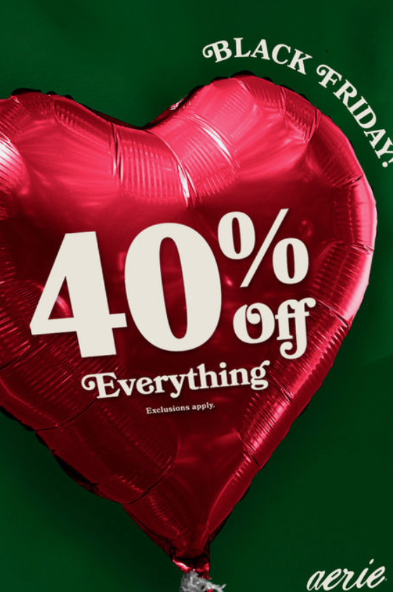
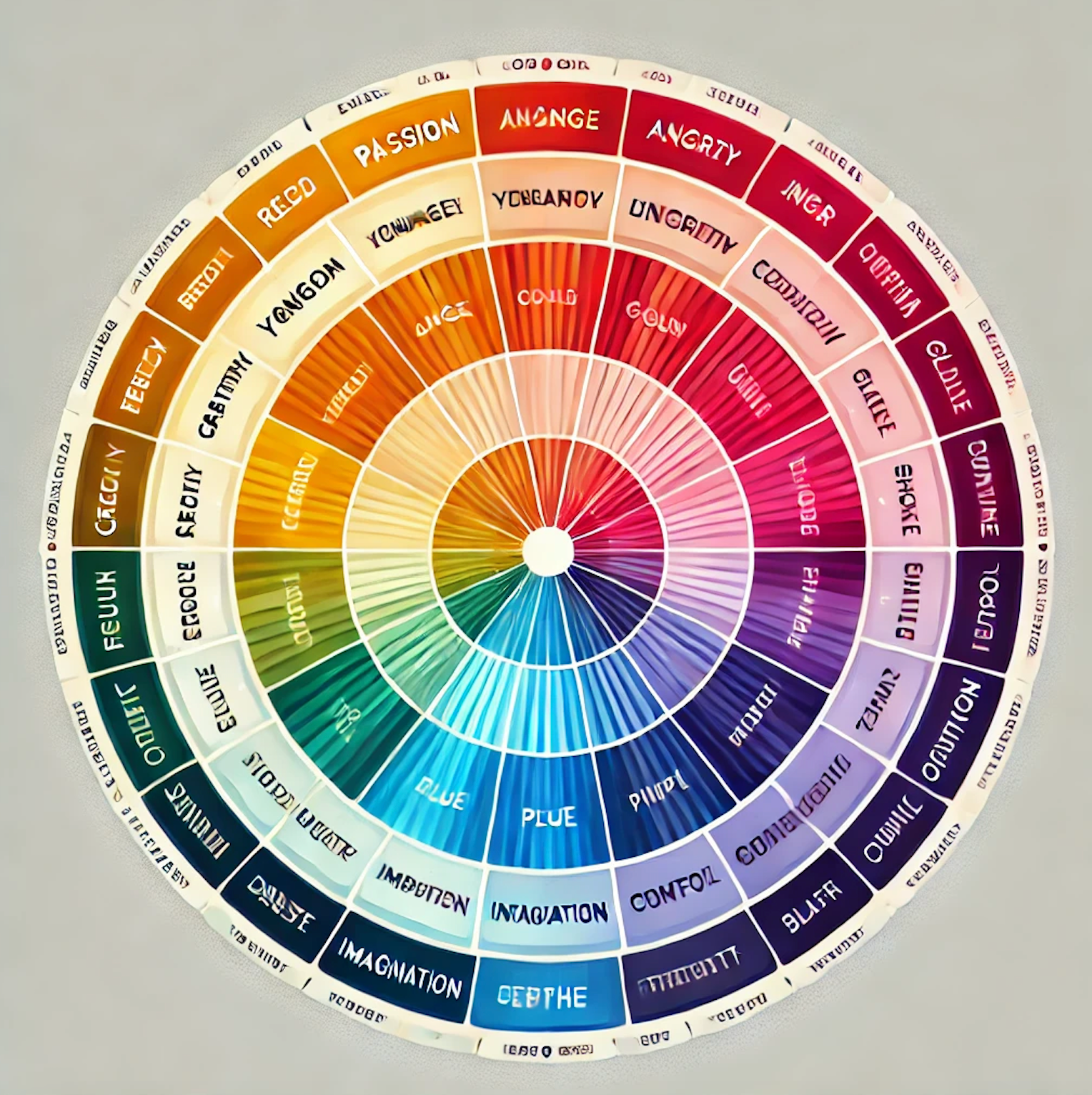
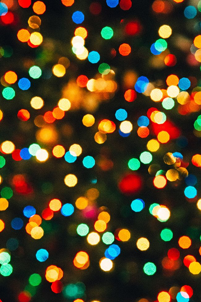
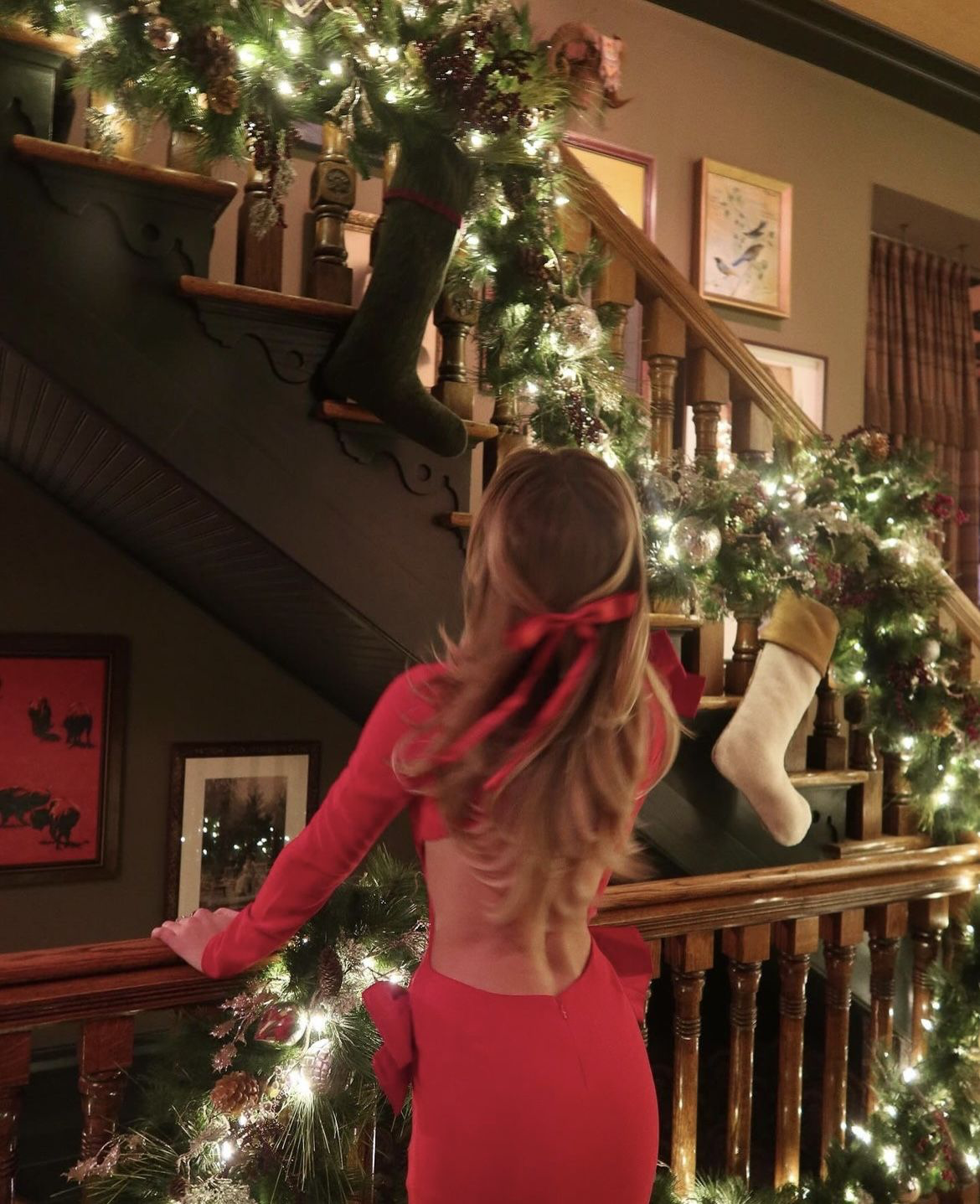
As shoppers, it’s very easy to make quick judgements based on visuals such as color before even noticing the fabric or silhouette. So when we’re out shopping in November and December, the reds, greens, golds, and blues naturally stand out. Maybe not to our conscious mind, but definitely to the emotions associated with them. Psychologically, red evokes love, passion, and excitement—some of the strongest Christmas-time feelings—and that’s why it is one of the main colors we see when shopping. Brands take advantage of this and channel those emotions when creating advertisements and designing products. Green represents harmony and renewal, bringing a sense of peace and prosperity. Because of this, marketers all over the world use green throughout their holiday tactics to trigger those calm, peaceful emotions.
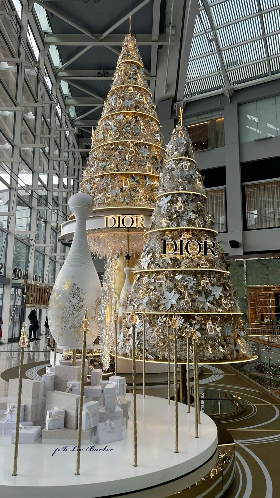
The same thing goes for golds and blues. Even though they aren’t the most traditional Christmas colors, they appear more than we might realize. Gold tends to be associated with luxury, wealth, and prestige, which is why it’s so common in high-end holiday campaigns. Gold gives us the impression that we are being presented with something valuable. Gift-giving during Christmas ranges from inexpensive little treats to designer pieces, which luxury brands certainly take advantage of. When you look at Christmas marketing in high-end stores, take a moment to notice if there’s more gold than usual—because there probably is. Then,
there are blues. Different shades of blue can evoke different emotions: darker blues feel confident and sophisticated, while lighter blues feel calm, gentle, and dainty. Even though most advertisements use red and green, blues and golds still show up just as much in the clothing itself. At the end of the day, whether we notice it or not, companies know exactly how to use these colors to their advantage.
So next time you go shopping, I want you to do this: gaze around the room—left and right, up and down—and notice what you see and the emotions that come with it. Did you see a 20% off sale sign on a green and red sweater? Did you come face to face with a beautiful gold dress? Did the display of the dress influence you to try it on? Was there a gorgeous blue scarf on display behind the glass? Did you feel the urge to buy it? These are small things that we assume have no significance behind them, but they really do. Christmas isn’t just about the holiday itself—it’s about how it makes you feel. And a big part of those emotions comes from the colors surrounding it and the clothing you show up in. Once you start paying attention, you realize the holiday magic isn’t accidental—it’s crafted color by color, feeling by feeling.
Edited by Isabella Zapata, Claudia Rothberg and Ava Palmieri